This is a piece I've been working on for a while now because it is a fascinating topic and, as I have said numerous times before, once you learn the magician's tricks, he can never fool you again. In today's post, I am going to share with you numerous different ways the media, Big Pharma, businesses, historians, statisticians, and more, lie legally without technically lying; the art of truthful deception.
NUMBER FUCKERY
“Advancements in medicine drastically increased the average lifespan!”, “Average pay, $49 an hour!”, or what about “Interest rates as low as 2%!” We see these things advertised, yet we can never get $49 an hour working as a cashier. Even with great credit, the interest rate we were offered was 5.5%, but at least we get to live longer, thanks to Big Pharma, we think to ourselves. But then, when we are reading historical content, we notice few people died of natural causes at 30 years old. We see the average person, whether he was from the 1500s or 1920s, lived to be at least 60, so where are these numbers coming from? (This may be one of the most important truthful deceptions to understand.)
Let’s use the example of lifespan. Here is a random group of 11 people and the ages they died:
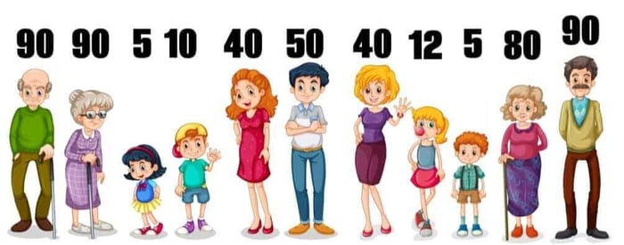
The first way to calculate lifespan is to take all the ages and divide by the number of people. In this case, 90+90+5+10+40+50+40+12+5+80+90 = 512, divided by 11 people = 46.55 years average life expectancy, based on the grouping.
Now, let’s say we want the number to be even lower because we want to show people dying as young as possible back then. The first method we could use is to count infant mortality. If we add only two infants to the group, both sadly passing away before reaching age 1, it drops the average life span down to only 36.57 years, but we are going to ignore this method for now.
Another trick is to use the median number. To get the median, we put the ages in order:

Then we find the center number: 40. There are five people older than 40 and five younger, thus making 40 the median:

As you can see, just by changing the way we produce the result, the average life expectancy dropped from 46.55 to 40. We shaved off 6.55 years!
Now, let’s say we want to show how amazing Big Pharma is and demonstrate how vaccines and prescriptions have added decades to our lives. To accomplish this, we look for the “mode”, which is the most common number. In this case, it’s 90!

Using the identical group of 11 people, we were able to prove the average number of years people lived was a tragic 40, and also prove it’s currently a whopping 90! And we did this without lying.
Now think of this in terms of salaries: “$66 average hourly pay!”, the company advertised on the billboard downtown, but when you applied, you were offered only $12 an hour, and that's before taxes. So how does that big sign advertise so much when it's actually so little?
In this case, we have four cashiers making $12 an hour, three store managers making $18, a regional manager making $85, a few higher-ups bringing in $95 and $120, and two co-founders of the company who both pay themselves $200 an hour. Once again, we can find the average by adding the different hourly wages:
12+12+12+12+18+18+18+85+95+120+200+200 = $802
Then we divide by the total number of employees (12), which gives us an incredible $66.83 average hourly pay. Sign me up for this job! But if we use the same numbers to get the median, the hourly pay drops to $18.

However, the most common pay, the mode, is actually only $12.

We went from almost $67 an hour average pay down to $12 without technically lying: truthful deception.
CLIMATE CHANGE
When the government wanted to statistically prove the weather was getting warmer by the year, they did so using a few different techniques. The first method deployed was designating zones that were hundreds of miles apart. They could then pull data from far away and claim that was the temperature of the location a hundred miles from it. Think of it kind of like gerrymandering the weather: make sure every zone has a desert, and boom! The average temp increases by many degrees.
Next, they reduced the number of weather observation points. There were once around 6,000 points, but they decreased to around 1,000. And it just so happened that the vast majority of the weather stations that were eliminated were those located in cooler locations.
ZONES
You would think, when the media reports school shootings and gun violence figures, they are based on a gun inside the school, or at least on the premises of the school, but this is not always the case. Just like with weather “zones”, schools are given a zone - I can’t remember the exact number, I think two to five miles radius when it comes to crime statistics - regardless, it shouldn’t be even one mile radius. This means when some jerkoff with road rage flashes his pistol at a fellow driver a half-mile from the school and the scared driver phones the police, this counts as school-related gun crime. (With that being said, some states do designate smaller zones, but every zone is larger than the actual property the school sits on.)

DATA “OVER TIME”
Let’s say this is the price of milk over time. Would you say the price has gone down? Or has it gone up?

What if I start the data at a later point in time by cropping the chart?

If I want to show extreme inflation, I can crop again.

When in reality, the price of milk isn’t much higher on one end of the spectrum than the other, and if you compare the spike versus the drops, it has actually been overall cheaper than it was at the beginning of the chart.

If the media wants to induce stress, they can display the soaring inflation graph. If they want to trigger a buying frenzy, they can show prices steadily rising - hurry, buy now! And if they want to make the public pleased with their political candidates, they can say prices are now nearly the same as they were 20 years ago.
INFLATION
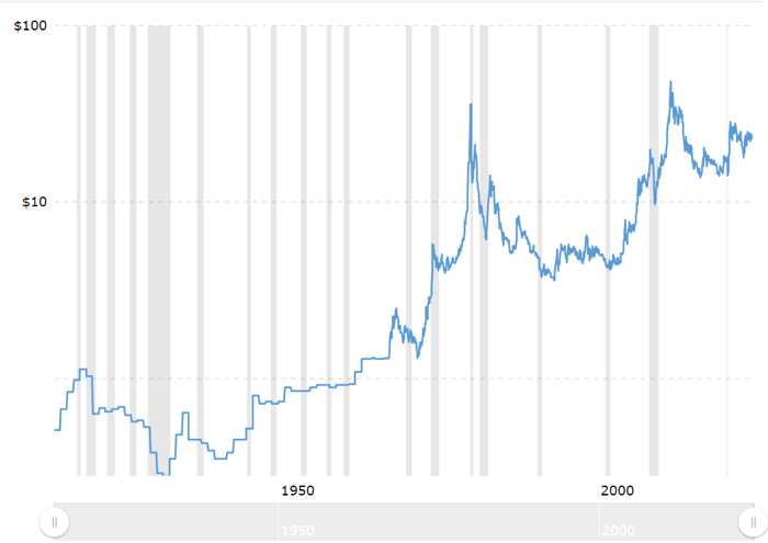
Not adjusting for inflation is another way to manipulate data. Here’s the price of silver history, which clearly shows it is a phenomenal investment, right?
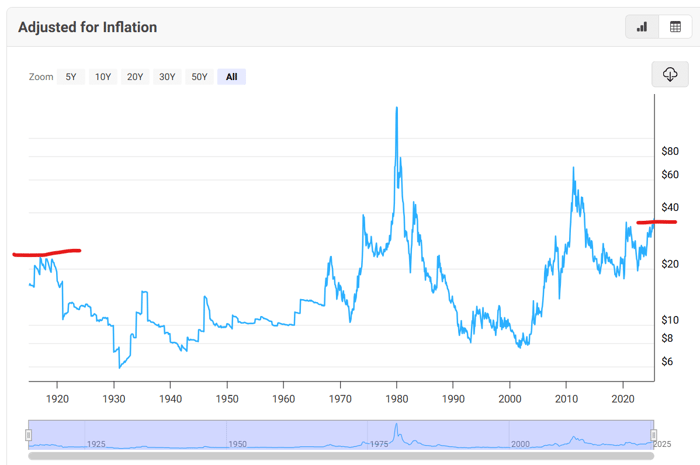
Well, here’s the same history of the price of silver with adjustment for inflation (which is very important to look at). Silver is almost the same price today as it was in 1915!
CHARTS
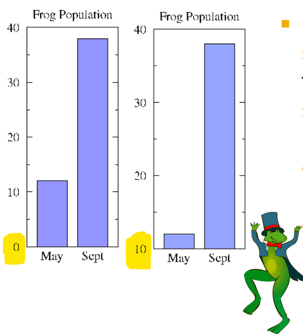
Just like with the graph above, charts are easily manipulated. Here is identical data; the only thing that changed is how the numbers appear on the X-axis (the vertical beam). On the chart on the left, the numbers are listed in intervals of 500 with 0 as the starting point, whereas on the right, the numbers begin with 3650 and increase by intervals of 50.
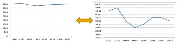
Huge visual difference, isn’t it?
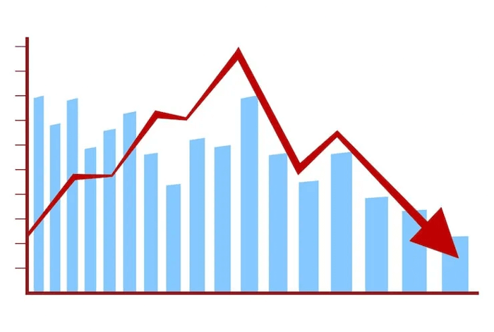
Here’s another example:
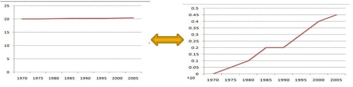
The same can be accomplished with bars:
THE DIPHTHERIA OUTBREAK
Schick tests began being used in schools and hospitals to find cases of diphtheria, and the more they tested, the more they found. Using these methods, in 1927, the Citizens' Medical Reference Bureau produced figures showing "an increase of more than 40 percent in diphtheria incidence…” Big Pharma then stepped in, peddling its putrid horse-blood-and-chemicals “anti-toxin”. Now, to make Pharma the hero, it was time for cases to decrease. J. T. Biggs, in his book, Sanitation vs. Vaccination, said, “the apparent lowering of the death-rate in diphtheria after antitoxin came in, was effected by the statistical juggling to include every benign sore throat as diphtheria”. When the excessive testing ended and coughs and fevers began being blamed on other diseases, cases plummeted, and the anti-toxin was credited as saving humanity.
RICKETS
A very similar thing happened with rickets as with diphtheria. In the case of rickets, the UK government ordered doctors to x-ray no less than 200 children each. The purpose was to look for covert rickets: improperly forming bones inside a child who otherwise looked perfectly healthy. When doctors began X-raying, rickets cases skyrocketed. Some doctors reported, with the assistance of X-rays, finding the disease in as many as 90% of their clients; meanwhile, other doctors couldn't find a single case.
The medical-science industry was convinced the cause of rickets was a lack of vitamin D, and absolutely no other cause was ever considered. This led to further mandatory fortification of food in the UK. After the fortification chemicals were put into the food supply, the government halted testing. With no funding allocated to testing, doctors no longer ran unwarranted X-rays, and just like that, rickets vanished. It is now reported that vitamin D fortification cured rickets, but in reality, stopping testing is what plummeted cases.
THE CRIME WAVE
A historic crime wave began when the media started looking for crime stories to report on. The same crime wave ended when papers stopped reporting it. Of course, excellent police work could be given accolades for ending the crime spree.

POISON PLACEBO
In Merck’s Gardasil vaccine clinical trials, Merck “spiked” the placebo with amorphous aluminum hydroxyphosphate sulfate (AAHS), a neurotoxin. The result was that approximately equal numbers of subjects in the vaccine group and the placebo group suffered adverse reactions. This allowed the adverse reactions in both groups to appear similar and gave the impression that the Gardasil HPV vaccine was “as safe as a placebo,” which people assumed was salt water or sugar pills.
In some cases, the placebo is literally the same product. In other cases, it’s a competitor drug. And, in almost all clinical trials, we have no idea what the placebo was because it isn’t listed anywhere. That’s right, the University of California reviewed almost 170 placebo-controlled trials and discovered 92% never even described the ingredients in their placebo pills. I’ve said this before, but I'll say it again: medical trials don’t need to prove a drug is safe; they need to prove the placebo is more dangerous.

INDEPENDENT LABS
Independent labs are another way to rig data (legally). What does independent lab even mean? The definition of independent laboratory is “a facility that performs testing or diagnostic services and is not owned, operated, controlled, or managed by a hospital, physician's office, or other healthcare provider” - a 22-year-old wearing Minecraft pajamas while sitting at his kitchen table with a microscope at 3 am would qualify as someone performing independent lab work because the term means nothing.
SURVEYS
Another popular way data is legally rigged is through the use of surveys. Surveys are not an accurate reflection of what is going on in society or even people's honest opinions because people want to give pleasing answers. This is so common that it has a name, “Self-Reporting Bias”. For example, let’s say you ask people how often they shower or if they recycle, the majority of responses are going to be whatever the societal norm is, not what the individual actually does. Who wants to admit to only showering once a week?
Another example, if we look back at the rickets situation, mothers were asked specifically if they feed their child nutritious foods filled with vitamin D. What mother would say no? We saw the same occur with surveys involving black mold. When scientists and the government wanted to prove black mold was highly dangerous, they only asked questions about health conditions and visible mold in the home. At no point did they consider pre-existing conditions, if the individual was a smoker, their eating habits, pollution, or anything other than the mold as the cause.
Equally, if you set up a booth at a dog show and ask people which is better, cats or dogs?, what do you think people are going to reply? As you can see, surveys can be intentionally designed to produce the desired results.
When surveys are conducted on the internet, the takers of the survey are typically readers of the site. For example, a survey that appears on CNN is not a survey I would ever take because I don’t visit their site. Therefore, the data within the survey is limited to CNN readers.
CHERRY PICKING DATA

Going back to the Gardasil trials, Merck did not report a large number of adverse reactions as Gardasil side effects. Instead, Merck categorized these serious illnesses as “new medical conditions” unrelated to the Gardasil vaccine. Close to 50% of the study participants reported a “new medical condition.” These included high rates of neurological, musculoskeletal, and autoimmune-related conditions. Additionally:
Many adverse reactions experienced by Gardasil clinical trial participants were never recorded.
Reports of serious events were not followed up.
Medical records were not reviewed.
Trial participants were told the vaccine was proven safe and the placebo was a saline solution, making it less likely they would report adverse Gardasil side effects.
In fact, in general, when people are told a reaction to something is common, they are unlikely to report it, thus skewing the adverse reactions to products in general. How many people get a rash from their new laundry detergent and contact the company? Very few. We all just throw out the soap and move on with life.
DISAPPEARING DATA
In other cases, such as the glyphosate studies, unfavorable data were simply not included in the results. Also, in the glyphosate trials (if you could even call them that), they needed to determine if there was a correlation between their poison and late spontaneous abortion. To accomplish this, they had questionnaires filled out by farm operators and eligible couples, but to their disappointment, the survey data suggested there was indeed an association between pregnant women being exposed to glyphosate and elevated risks of late spontaneous abortion, so they just didn't publish that study.
If you visit ClinicalTrials.gov, you can research trials for all kinds of medications. What you will find interesting is the percentage of times no results are shared. We can assume that means they weren’t favorable.

STATISTICAL DATA SCRAPING
When Charleston University researchers analyzed statistical data touted as fact - data that had been scraped from social media - they discovered there was no accounting for bots, hackers, or fake accounts.

Additionally, when data scraping occurs, there is no way to tell the poster’s intention. This means if 5,000 people sarcastically tweeted “I just love my iPhone spying on me!”, it would be counted as 5,000 individuals who enjoy Apple products.
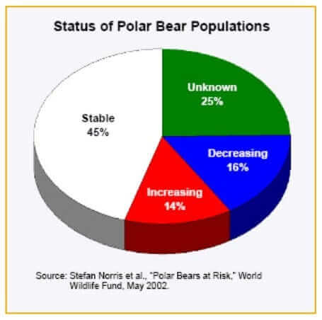
SAVE THE BEARS
The World Wildlife Fund (WWF) stays in business through fear campaigns, many (all?) of which are based on 100% legal data rigging. For example, we have all heard that the polar bears are going extinct due to global warming, right? But let’s look closer at the data:
According to the WWF, there are about 20 distinct polar bear populations totaling approximately 22,000 polar bears worldwide. Out of these 20 groups, only two are allegedly decreasing in population, 10 are listed as stable, two groups are actually increasing, and the remaining six, nobody has the slightest clue what they're doing, even the WWF doesn't know. So what this organization is doing is looking exclusively at the two allegedly decreasing groups and saying, “The polar bear population is decreasing!”, thus implying all polar bears are on the verge of being gone forever. When laid out on an honest pie chart, we can see the shenanigans.
SMALL SAMPLE SIZES
When the media reports 90% of people feel a certain way or take a certain action, they typically fail to tell you how many total people were included in the group. In theory, they could have only asked 10 people in their own office and come up with the statistic. If the number of people isn’t listed, chances are it’s a laughable amount. Although stupid statistics are generally harmless, they can, and do, influence the opinion of others. When people in Detroit read headline after headline claiming 98% of Michigan was vaccinated against Covid, it was subliminal messaging for them to follow the trend. Who wants to be grouped in with those awful conspiracy theorists that make up the 2% of anti-vaxxers?
Small sample sizes go beyond media headlines. When the makers of Round-Up needed to prove that the dust residue wasn’t harmful, they collected 33 total dust samples from only five farmhouses and six non-farmhouses, only in Iowa.
EXCLUDED PARTICIPANTS
Amusingly, almost all drug and vaccine trials require individuals to be young and healthy, which seems counterproductive, being that the drug itself will be pushed upon (and pushed into) sick, often old, people. “Cancer trials routinely reject older patients, patients with additional health conditions like diabetes, heart disease, hepatitis, HIV or other cancers; or those who have poor “performance scores,” a measure of physical functionality.”
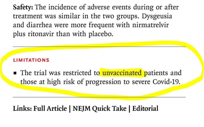
For the Pfizer Paxlovid Safety Study, only unvaccinated individuals could participate.
SHORT-TERM STUDIES
As discussed in my piece WHO ADMITS NO EVIDENCE "VITAMIN A" IS HELPFUL, since the inception of synthetic “vitamin A” through 2018, the longest study ever conducted was only nine total months. There has never been any study showing the health effects of consuming this lab-made concoction for 5, 10, 20, 30, or more years.
For the cancer portion of the glyphosate trials study, five total forestry workers sprayed glyphosate for only six total hours a day throughout the course of a single week. At the end of the week, each worker was given a medical exam, and none of them tested positive for cancer. This allowed them to say glyphosate does not cause cancer.
The animal trial was performed on rats, and this one lasted two total years, but other than that, the glyphosate animal studies only lasted 13 weeks, with the shortest study being four total hours. The study that lasted 24 months consisted of rats being fed 99% pure glyphosate mixed into their normal diet. However, the chemical concoction used in products like Roundup is not 99% pure glyphosate, so this was of no genuine comparison. In the bird study, a single dose of glyphosate was fed orally to a single quail. Because it didn't die, it proved it was practically non-toxic to birds. A fish study lasted 48 to 96 total hours.
INSUBSTANTIAL NUMBER OF TRIALS
Although the favorable result is being reported, they don't tell you how many trials were conducted. One trial proves absolutely nothing. A single trial would be like flipping a penny, having it land on heads, and then saying the penny always lands on heads when you flip it…
And that, my friends, is a whole lotta ways we can be deceived… truthfully.
I hope you loved this post! If you appreciate my research, please consider hooking me up with a coffee or making a Ko-Fi donation. These articles take a lot of time, and I do it for free because I love raising awareness, but the articles aren't actually free to write. There are surprisingly a lot of costs that go into being a journalist, and contributions REALLY help!


![Is Garlic Harmful to Dogs? Let's Review the Studies [by Agent131711]](https://dropinblog.net/cdn-cgi/image/fit=scale-down,format=auto,width=700/34264201/files/featured/7045f3d8-f1ba-46f8-85b6-308832f0c180-1400x788.webp)
![Are Raisins and Grapes ACTUALLY Toxic To Dogs? [By Agent131711]](https://dropinblog.net/cdn-cgi/image/fit=scale-down,format=auto,width=700/34264201/files/featured/e6dfb138-526f-43e7-bca7-19f4109562e3-1400x788.webp)